Tiff’s Treats
Tiff’s Treats is a cookie company that is based in Austin. Since opening, they have opened up many locations across the U.S over the years, and continue to grow. The logo and branding has remained the same since they started. You can see their current logo below.
The Challenge
To rebrand an existing company. As a fan of their cookies for nearly a decade, I chose to go with the beloved Tiff’s Treats. Tiff’s has been a staple in Austin for awhile, and I needed to create something that people could still associate the company with that didn’t look too out of place.
The Goal
The goal for this rebrand would be to improve Tiff’s logo and overall brand experience. Tiff’s Treats has expanded rapidly over the years, serving delicious cookies, and donating to good causes. I wanted to give their look a different twist while still keeping certain admirable features intact.
Target Audience
The target audience would really be people of all ages that enjoy warm, comforting cookies. Tiff’s is also known for delivering for special occasions, so a lot of customers could be celebrating something special.
Process
To approach this rebrand, I examined their current logo and aspects of the experience and services they provide. I kept all of those things in mind as I started the sketching phase of the logos.
The blue ribbon tied around the boxes is a very familiar component that people can associate Tiff’s with, so I knew I wanted to keep that in the brand somehow. Because that blue color is such a strong part of their current branding, I knew I didn’t really need to tweak the color palette as much. I just wanted to add a little more visual interest, and modern touch to the logo, and then tie that into the rest of the brand. With that in mind, I began refining and digitizing my strongest sketch.

Solution
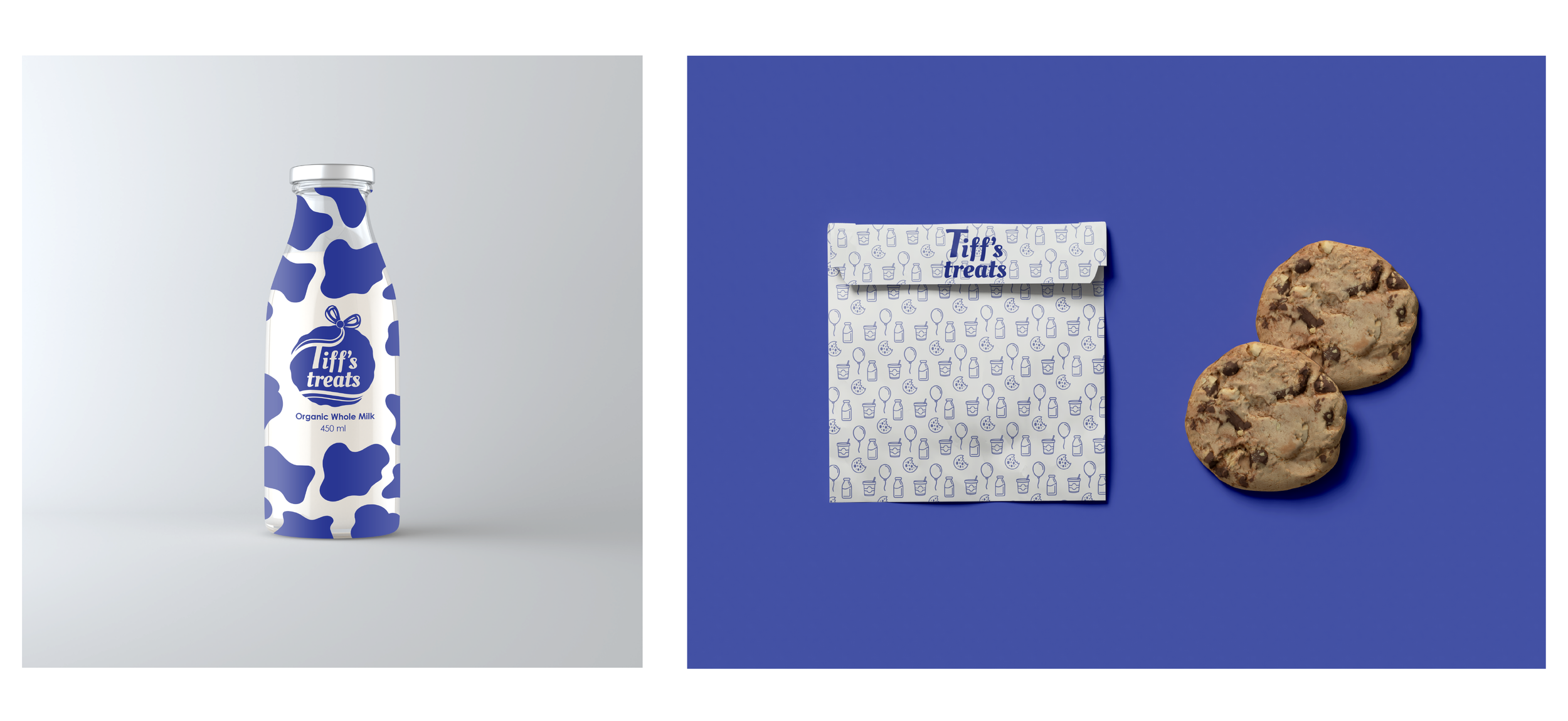
To expand on the logo, I created different variations and a set of icons associated with Tiff’s service that could strengthen the overall look of the brand. I thought about every part of Tiff’s that makes them who they are. The packaging, signage, and even the delivery vehicle, since delivery is such a big part of their service. I still see Tiff’s delivery cars on the roads of Austin frequently.
Once I developed the brand toolbox of elements, I used the pieces for different deliverables wherever I could see that they would fit.
Reflection
As a long time fan of this company, I really enjoyed this rebranding project. I loved developing a solution with a more modern touch to the brand while making it still feel like the Tiff’s Treats I know and love. Building out all the brand’s pieces and finding out ways to incorporate them felt like I was building a puzzle. I’m happy with the end result, and I hope to maybe present this to Tiff’s Treats one day.


