Night Flight
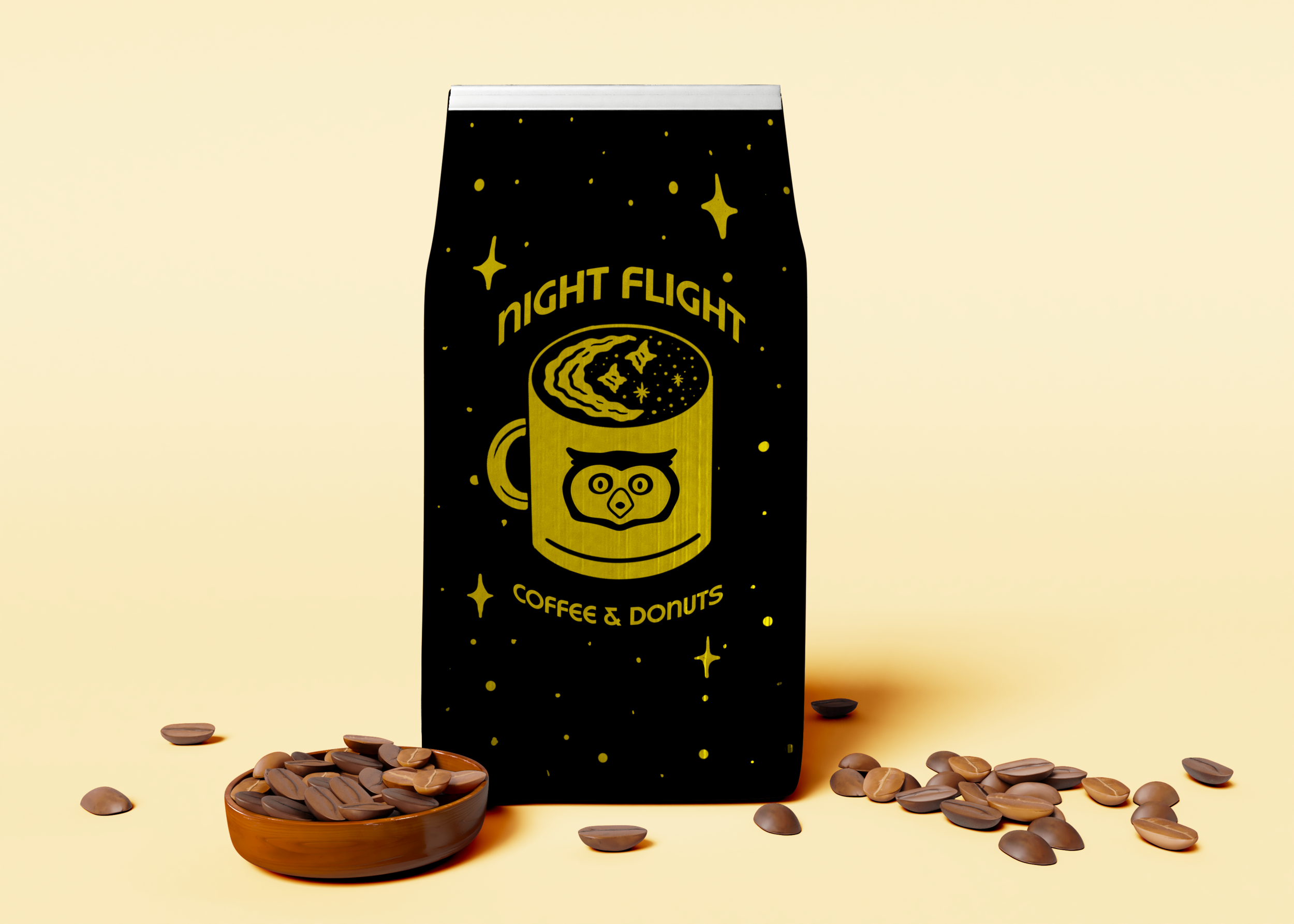
Night Flight is a concept for a round the clock coffee and doughnuts joint. The brand’s theme is inspired by the night, and a place for creatures of the night to come get their fix with strong coffee and delicious doughnuts.
The Challenge
To create a business with a cool concept and complete branding. The concept would have to be seamlessly incorporated into different deliverables and branded elements in order to create an effective and complete brand.
The Goal
The goal for creating the Night Flight brand would be to incorporate themes of the night into the brand, and an emphasis on flying. This would include a nocturnal animal like the owl, stars, and colors of black and yellow. I wanted to illustrate different elements within this theme to work like a toolbox for the brand to use each piece for different deliverables that you may find at a place like this.
Target Audience
Night Flight’s main target audience would be really any night owls with a late schedule, whether it be industry workers getting off of a late shift, students pulling an all night study session, or just anyone looking for good doughnuts or coffee. Though, this place is open late, the audience would also include people that need to start off their day with some good, strong coffee and delicious doughnuts.
Process
I approached this project by gathering inspiration from different elements of nightlife. I began sketching out ideas for the logo with nocturnal animals, doughnuts, and things with wings in mind. I sketched some ideas digitally on a black background to see if that would evoke night-inspired ideas.
The first rounds of the wordmark were a light and playful handwritten type, and I tried some versions of the owl incorporated with it. With the help of my peers, I decided it would represent the brand better with a typeface that carried a little more weight and really popped off of a black background. I found a more bold typeface to incorporate into the logo wordmark. The typeface is strong, works well on black, and the letterforms have a curved round edge that mimics the round edges of a doughnut. To incorporate the element of flying, I gave the wordmark a pair of wings.
Now that I developed a wordmark for the brand, I wanted to build a brand package with illustrations that represent the different elements of the Night Flight brand. The wings were tied into three concepts, like the owl, the flying doughnut, and the crest that can be seen on the owl’s chest. I made a few other illustrations like the Ouroboros doughnut, and the doughnut clock to represent the endless cycle of hustling Night Flight conveys.
Solution
Once I built my branding elements out and refined them, I had to focus on when to appropriately use all of these. I used small details from the illustrations to create a pattern for the brand, and the incorporation of black and yellow to tie together the feeling of the night. I wanted all of these things to create an experience and the feeling of almost being nocturnal in a way.
Reflection
I really enjoyed working on this project, and building a brand that provides a unique experience. Throughout this process, I learned a lot about creating an entire concept from scratch, and backing up that concept with relevant elements in order to enhance a brand and experience. I’ve always been a big fan of coffee and doughnuts, so it was a pleasure to envision and create my dream concept that combines the two!


