Thirios Wine Co.
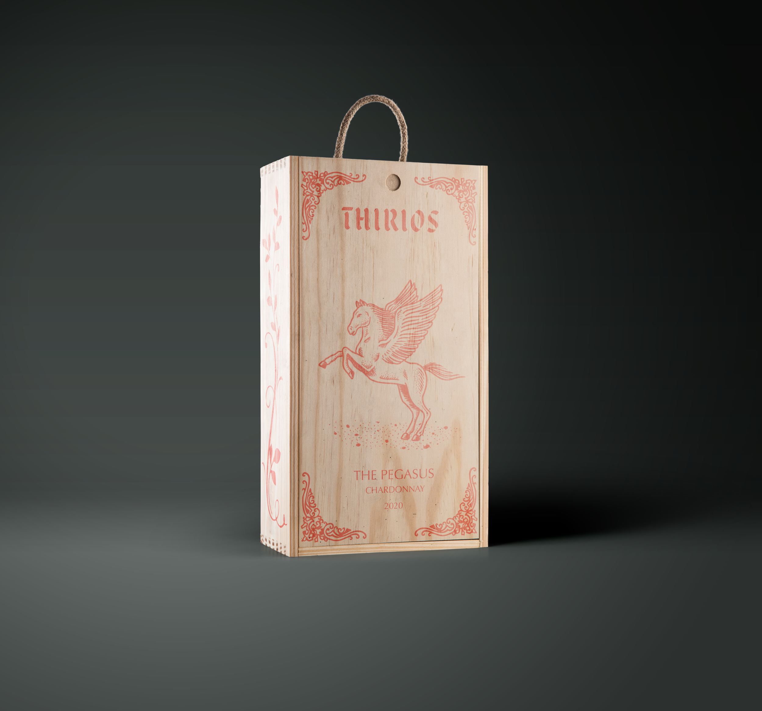
Thirios is a concept for a company that produces quality wines. The word “thirios” translates to “beast” in the Greek language. The brand incorporates the history of Greek mythology using illustrations and embellishments that are inspired by the literature and drawings created primarily during the Geometric Period that spanned from 900 to 800 BC.
The Challenge
To create a beverage concept complete with branding, packaging, and different flavors. The branding should be fluid and consistent across the various flavors, but different enough to represent the different flavors.
The Goal
The goal for creating the Thirios brand, would be to incorporate classic style illustrations of the beasts on the labels with a strong color palette, and typography. All the different flavors should create a cohesive unit.
Target Audience
Thirios’ target audience is adults that enjoy good wine, and are willing to pay a little extra for quality. Ages ranging from 25-65 years old. Thirios drinkers may also have an appreciation for mythology.
Process
I first started off the branding process, by gathering all my inspiration and sketching concepts for the logo wordmark. I wanted to give the logo a mystical fantasy vibe, and I took inspiration from old fantasy novels and the typography used.
Once I found a good direction I wanted to go in, I began the search for the best typeface to match my favorite sketches. My chosen typeface would end up combining elements from multiple sketches that I thought were the strongest.
Now that I had a brand logo, I then started to sketch out the beasts that I would use for the labels. After researching the long list of beasts from Greek mythology, I narrowed down my 3 flavors. The Cyclops, a bold Cabernet Sauvignon, The Pegasus, a buttery Chardonnay, and The Siren, a bright Grenache Rose.
Just like the logo sketch, I then started digitizing my beasts for the labels.
Solution
Now that I had my illustrations and logo, I needed a good color palette to tie the whole package together in a cohesive way. Each label would feature their complimentary color combo, and when all bottles were grouped together, they would look like a complete family of monsters.

Reflection
This project turned out to be one of my favorites. I had never conceptualized a brand for something like a beverage that had to incorporate different flavors. The challenge of creating different designs for different flavors, but having everything work together at the same time was a great learning experience. I learned a lot about the use of color in my designs, creating custom typography, and incorporating illustrations effectively.


